
relationSHIP
An online dating app assisting young professionals to form meaningful connections in a limited amount of time. While dating apps like Tinder and Bumble, enable users swipe through a parade of pictures in the hopes of meeting someone who they like, they end up trying to avoid individuals looking to pass time or engage in casual dating, and these young professionals are left frustrated with matches and conversations that never amount to anything. Ship, solves that problem.
DATES: Sept 2018 - Dec 2018
ROLE: Team Project
MEMBERS: Francesca Kennedy, Arwa EL Hussien, Sicong Liu, Suroor Z Rashid
PROBLEM STATEMENT
Online Dating Applications are not meeting the goals of achieving long-term partnership amongst users, which is causing user frustration, loneliness, and increased competition for our business. How might we improve dating apps so that our customers are more successful based on the number of long-term partnerships achieved through the app, user turnover, and number of matches?
SECONDARY RESEARCH
Our secondary research consisted of a literature review and review of online dating applications, through both web marketing and user reviews. We prioritized more recently published blogs, articles, and reviews due to quickly changing field of online dating, due to increased competition and technological advancements. We consulted the Google Play reviews of current dating applications to understand what pain points current users experience with the most popular dating apps. We also searched for online articles written by individuals sharing common problems and personal anecdotes with popular dating apps. Some of the major pain points found were
Faux results: fake profiles, matches that don’t lead to anything
Messaging: frustrating messages, rarely getting responses, rude messages
Cost: bombarded to pay for “premium” features
Gamification: addiction to app, feels like a game
Connections: hard to make connections, relationships are short-lived
Number of apps: many options, unsure which app offers “best matches”
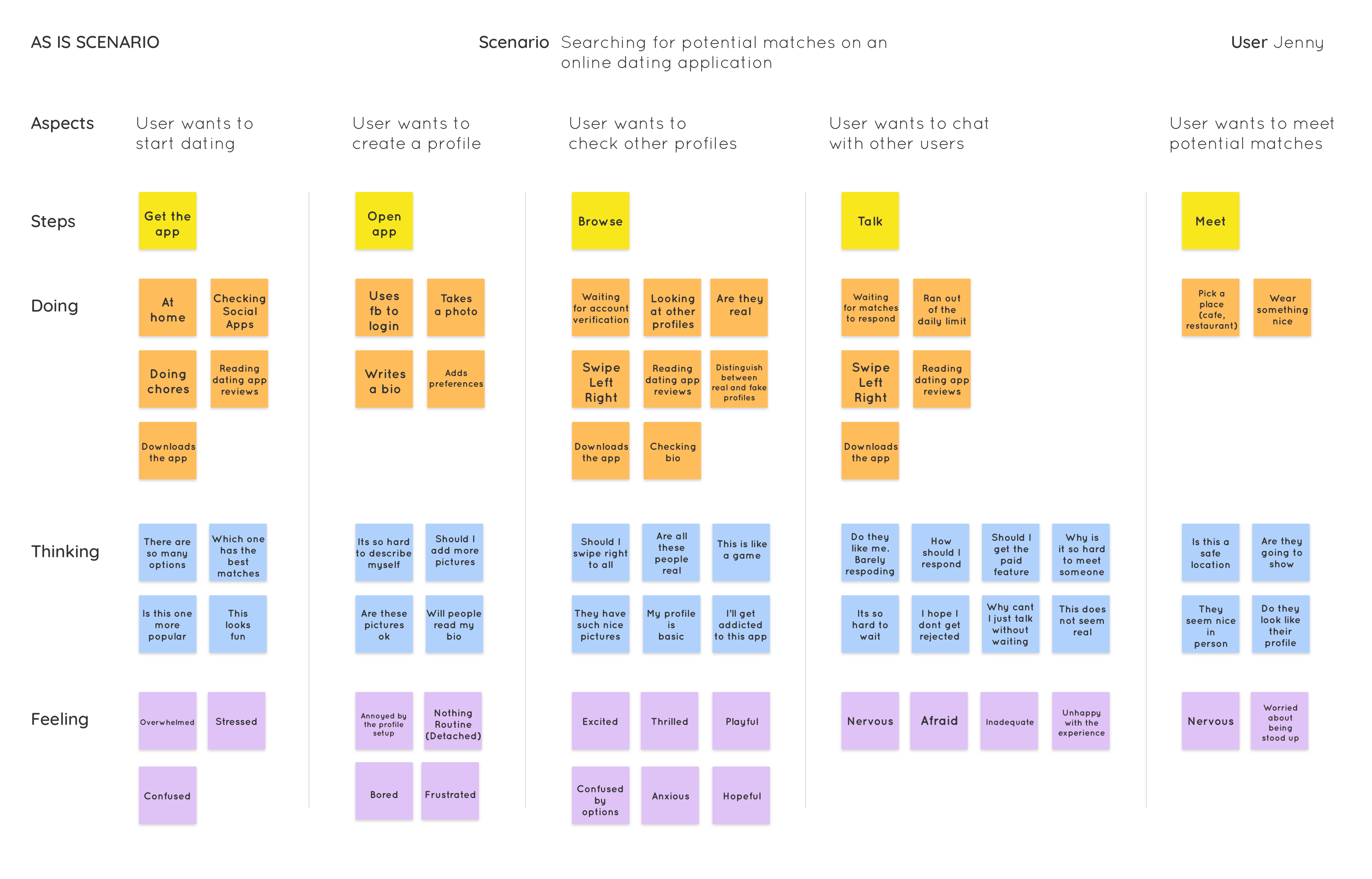
AS IS SCENARIO
Based on our findings we put together an As is Scenario

PRIMARY RESEARCH
To collect our primary research, our team used two collection methods: an in-person interview and an online survey. This yielded 76 total participants. Both methods collected both qualitative and quantitative data (with emphasis place on qualitative data) using both open-ended and closed-ended questions.
Interviews
Interviews were conducted with 8 participants, recruited from either the University of Toronto campus or workplaces in the Greater Toronto Area. All had used at least two dating applications and we’re between the ages of 18 - 30. Interviews were conducted over a two day period.
Surveys
Over a one week period, 68 people responded to our survey, of which 27 passed our screener. Surveys were distributed online via social media networks and contained a variation of closed and open-ended questions using Google Forms.
INSIGHTS
Matches are nothing like their profiles
There is lack of personal engagement
Not a lot of information about people on the app
Having to filter through rude or inappropriate messages
There is a safety issue when meeting new people
Ghosting is hurtful
It involves a lot of effort
It is time consuming
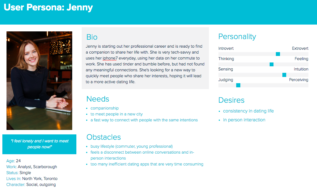
PERSONA

EMPATHY MAP
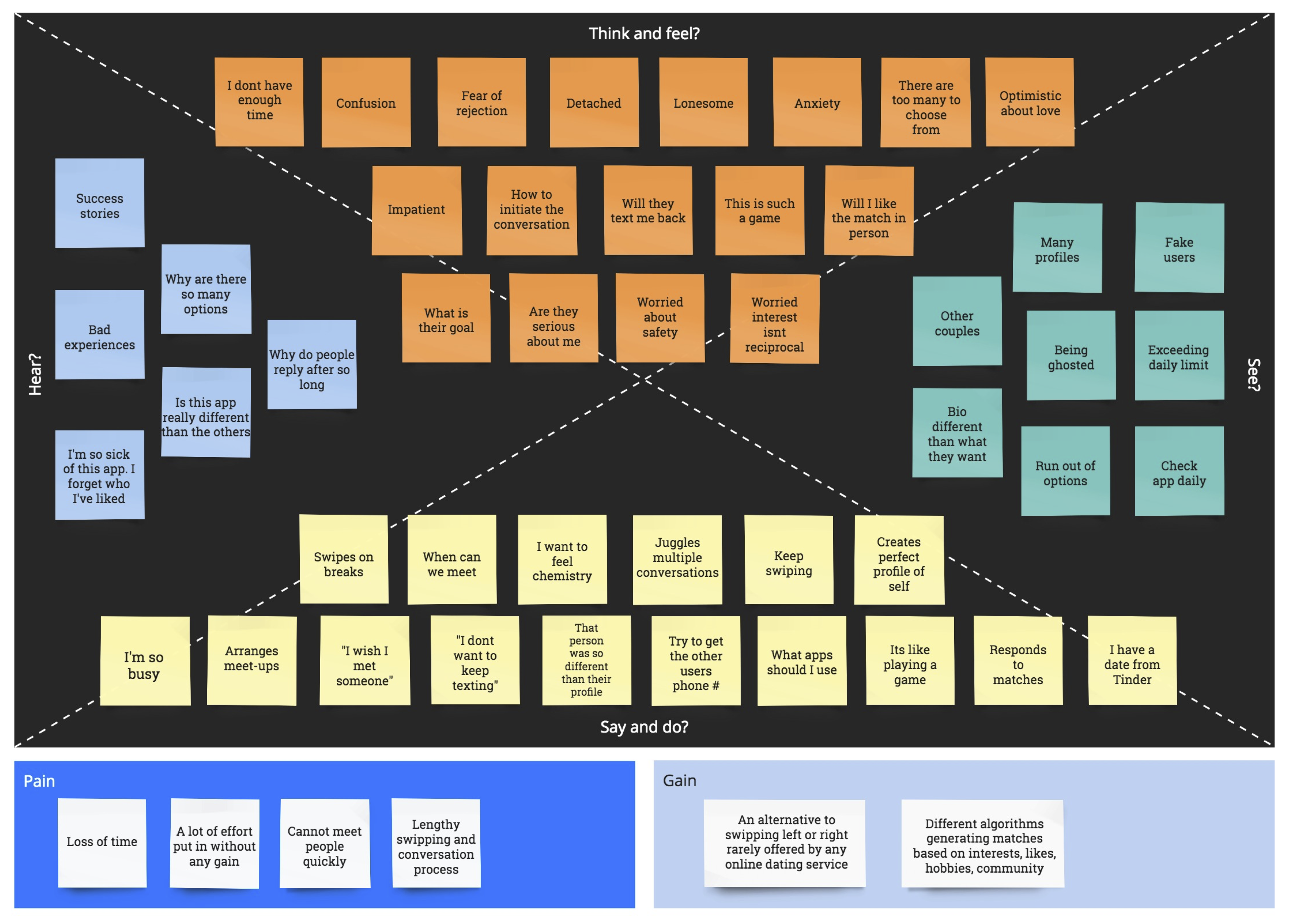

NEEDS
The user needs a way to pick who to talk to, so that they can go on fewer dates, but talk to other people with similar interests.
Desire: to meet new people who have similar interests.
Pain point: users are frustrated that they can “swipe” a lot and match with a large number of people, but have very few conversations.
The user needs a way to identify authentic people (on dating apps), so that they spend less time searching.
Desire: to filter through insincere profiles.
Pain point: Users are frustrated with fake profiles and embellished profiles
The user needs a way to only see users with common interests so that they match more efficiently, spending less time on dating apps and and have a lower number of matches from before.
Desire: to connect only with people who share her interests and intentions.
Pain point: Users are frustrated with how much effort and time it takes to understand other people’s intentions.
The user needs a way to gain meaningful connections with people so that they are less lonely, and aren't spending friday nights alone in this new city.
Goal: Foster meaningful connections with new people, who they are not meeting at work and in life.
Pain point: Users find it difficult to connect with others who are not as interested in the conversation as they are. This connects with the
frustration about intentions, as differing intentions cause weak connections.
The user needs a way to communicate smoothly with others so that they feels safer
Need: to feel safe when meeting people online.
Desire: not to receive lewd messages when meeting people online.
Pain point: Users feel uneasy when meeting people in person after having been introduced through a dating app, as they are unsure what the person will be like.
One of the most prominent pain points is the frustration with how long it took and much effort it took (i.e. a long conversation) before the other person’s intention in using the app was clear. This the key pain point that drove our needs statements, although other pain points helped shape some of them as well (such as the concern about safety). These same pain points that shaped our needs statements influenced our big ideas.
BIG IDEAS
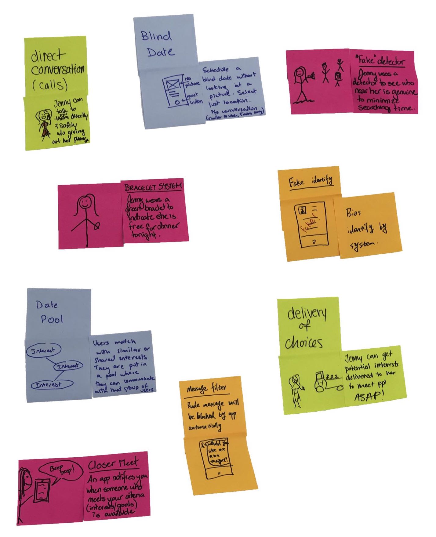
- Having the user set themselves up on a blind date without looking at any profiles.
- A system that would match users automatically based on their common interests eliminating the need for swiping.
- A tool that would alert and block the user from browsing fake profiles.
- A filtering extension that would filter through rude messages from unwanted users.
- A calling feature allowing users to call potential matches without giving out any information.
ABSURD IDEAS
Having an uber delivering potential matches to the user
A fake detector gun, alerting the user of fake untrustworthy profiles
A dating bracelet displaying the users availability status

RANKED IDEAS
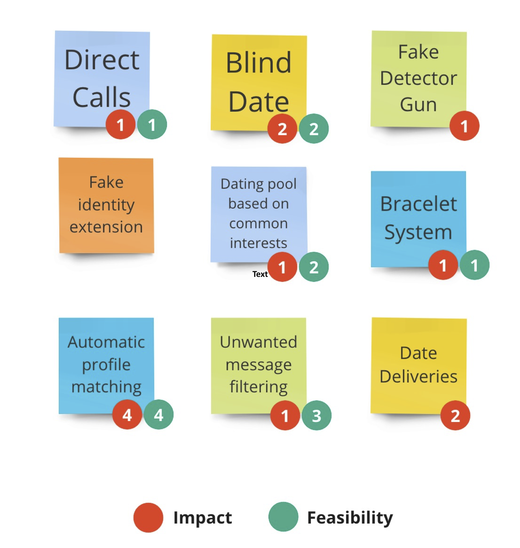
The team then voted on the ideas which were high in feasibility and impact. Each member got three or four dots of each colour to vote on which ideas they believe would have the highest impact on our users based on the biggest pain points reflected in our needs statements, as well as the ideas that would be the most feasible in respects to current technological abilities.

PRIORITIZATION GRID
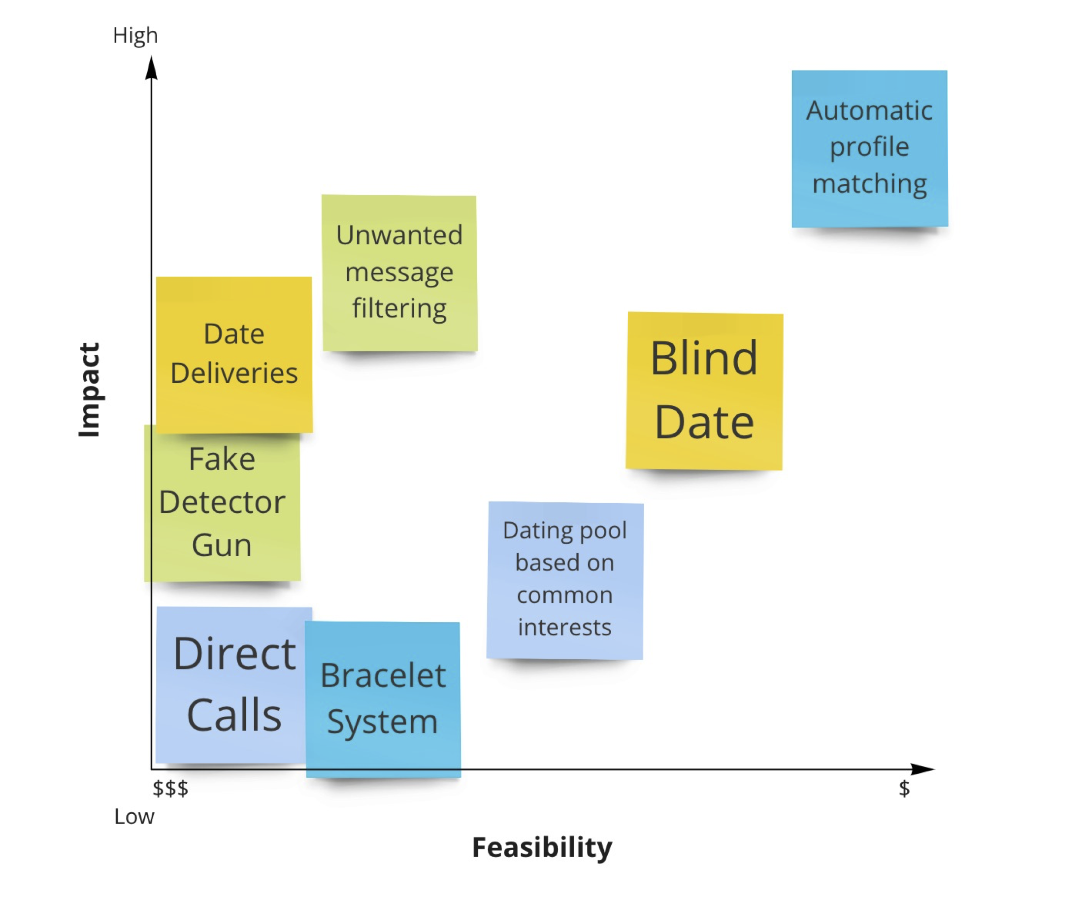
We then took the ideas with the highest votes of impact and feasibility and placed them on a prioritization grid. Most of our ideas fell in the bottom and middle section of the grid, prompting that they be removed from future iterations. The concept with the highest feasibility and most impact is visually clear as it is in the top right area: automatically matching dating applicants based on their common interests.

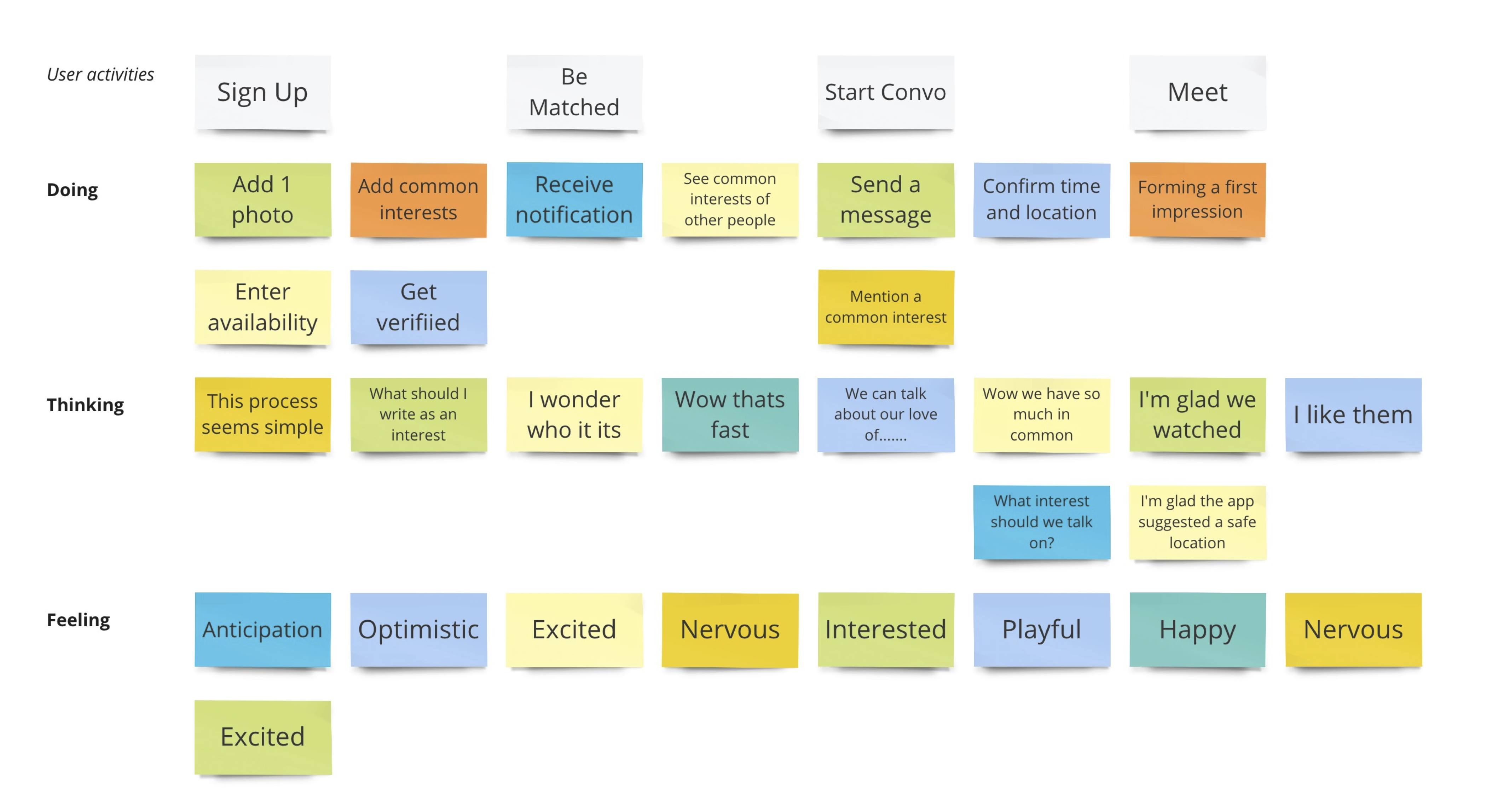
TO BE SCENARIO
After we finished our search, we summarized and analyzed results and realized what real users needs are. So we built this to-be scenario based on what we found. This scenario shows the new way of using online dating app after we provide a user focused product.
Sign Up
Be Matched
Start a Conversation
Meet

LOW FIDELITY PROTOTYPE
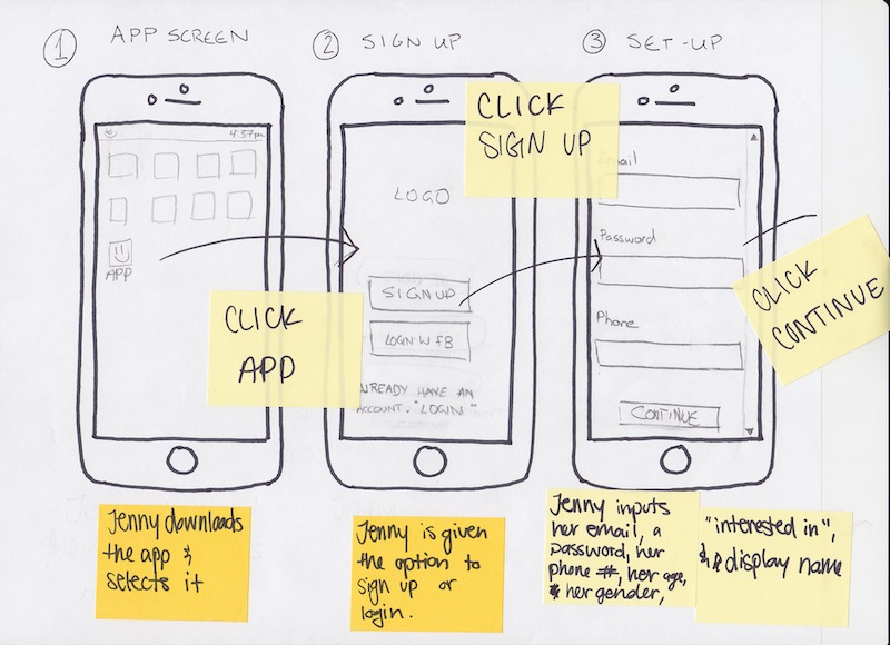
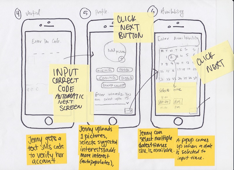
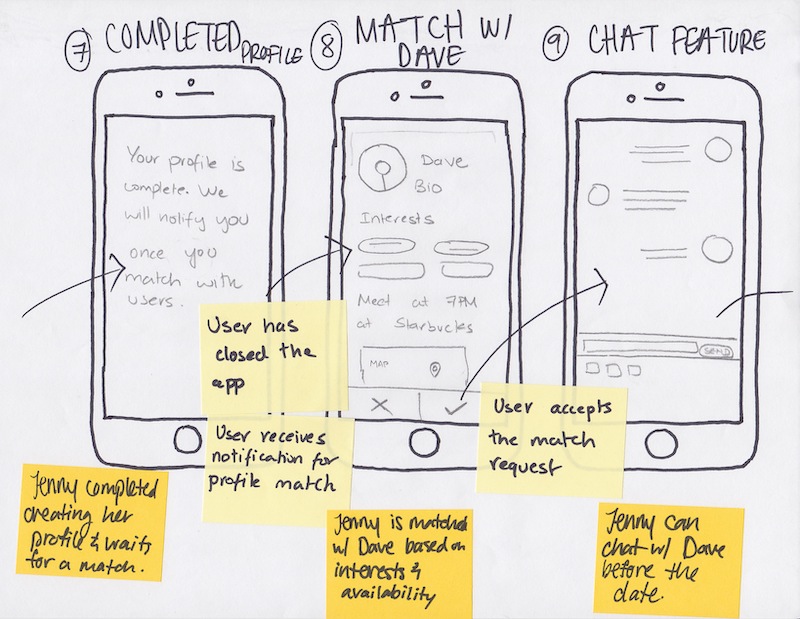
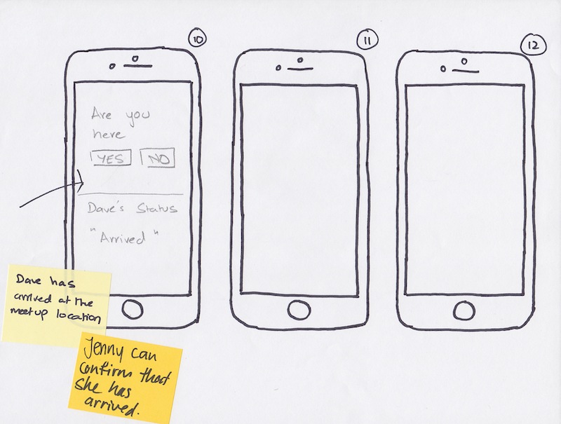
We drew out a sample of what our app would look like so that we could have a prototype that’s quick and easy to change. Our prototype focused on a “happy path” of the main tasks of creating a profile and getting matched with someone. The app automatically generates a match for the user and shares at least 5 common interest and part of their availability.
PROTOTYPE TESTING
After we finished our lean research, we summary the results into 6 opportunities:
- Interests
- Options
- Pictures
- Buttons
- Distance
- Limited time
- Selfie
Interests
Our paper prototype only offered 5 selections, and we required at least 10 interests, which means users have to enter 5 to 10 interests by their own. It is inconvenient and too much work for users. Therefore, we prepared to have more options or make a list of interests to allow users to make selections.
Pictures
In the paper prototype, we only request 1 picture for users’ profiles. Some users thought it is too less because pictures are be edited, so they need more pictures to distinguish if their pictures are real. Tinder requires at least 5 pictures for each user, and we thought it is a reasonable number. Users are now required to add more than 5 pictures. They are also allowed review their profiles’ pictures at any time.
Buttons
There wasn’t a button that allowed users to go back to the last screen or check the profile and change the time availability. After the search, we found that backward buttons are really helpful and necessary. So we decided to add two button at right and left corner of screen so that user can review their profiles and change time availability at any time.
Distance
User wants to match people without a specific location. For example, they want to meet people who is within 15 kms. This is a good idea, but we will do in another way. We will ask user to enter their location when they create their profile, and we will use that location for matching process. The reason we doing in that way is because we don’t want the purpose of using our app being changed. Our app is not a good choice to be used during the traveling.
Limited Time
Match will disappear if users didn't respond after being matched for 72 hours. And they have to re-login to the app and start a match process again. Currently, we don’t take this idea because this could push some users, and we don’t want to rush our users. However, a quick match process is also one of our goal. So we need to balance the relations between these two goals before we implementing this idea.
Selfie
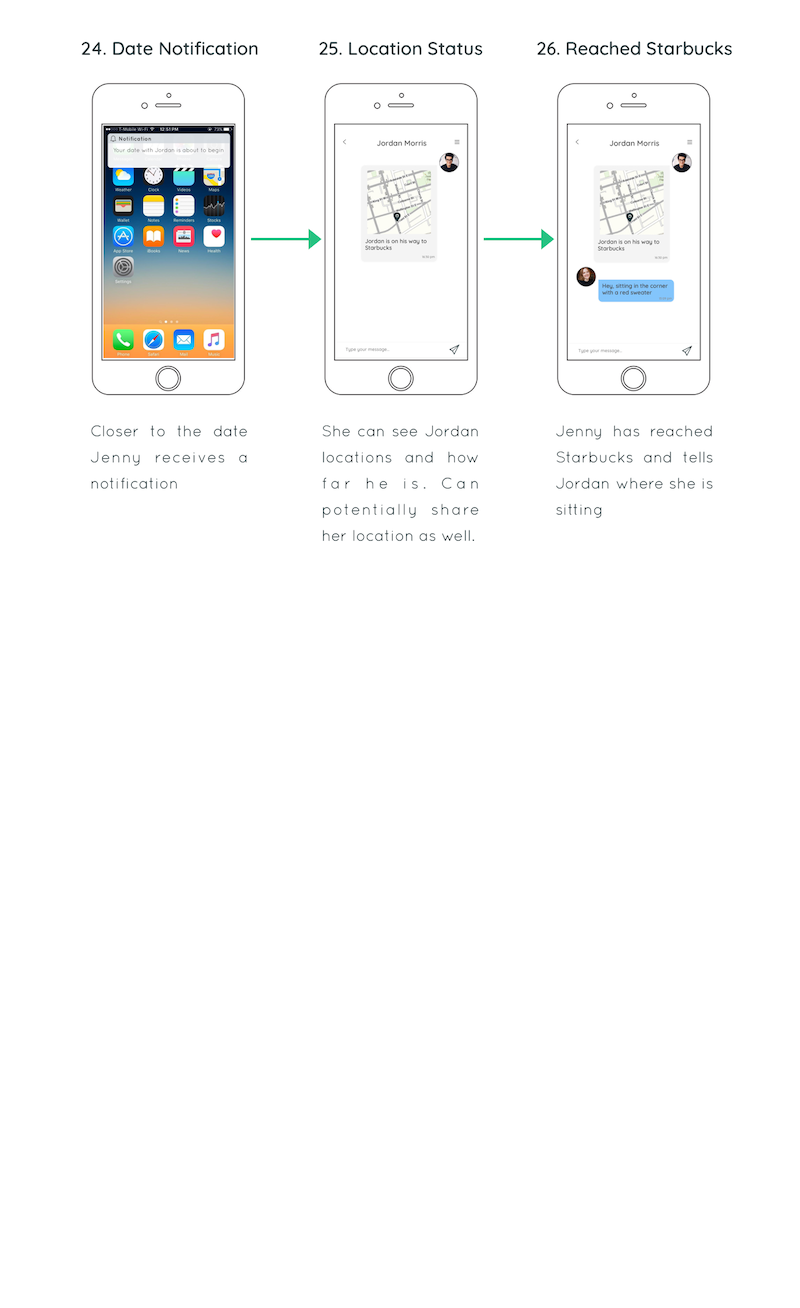
After users have arrived at the meeting place, they can have a selfie picture and sent it to the person they are going to meet with so that they can find each other very quick. In our medium fidelity prototype, we developed this idea. Users can see the real location of that person they are going to meet with. And they are also able to chat in the app to tell the other where they are sitting at.
MID FIDELITY PROTOTYPE
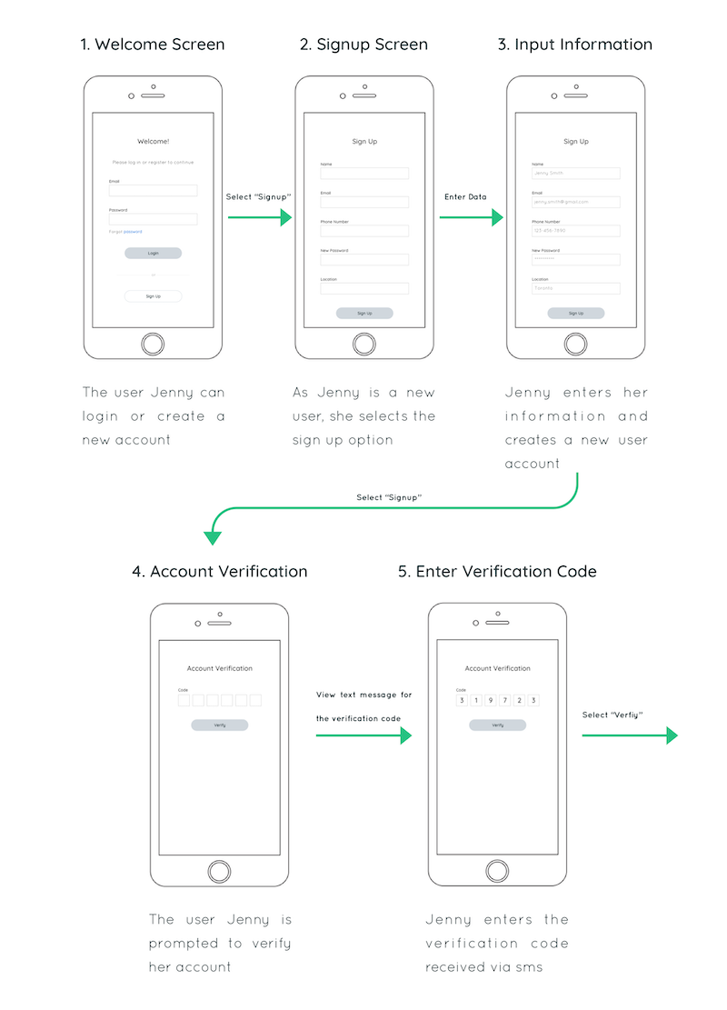
Our paper prototype user testing feedback was applied to our medium fidelity prototype. The goal of our design is to create matches based off of compatibility in order to facilitate quick, in-person connections. It displays the step by step process from account created to going on a date with a match suggested by the app. The prototype was designed in Sketch.
Invision Link: https://invis.io/ZJP72DSUQD3
Step 1 - Account Creation
The user opens the app and signs up to create a new user account. This sign up is essential for first time users after which they can just login afterwards. Once the user hits the sign up button they are prompted with a form to enter their personal information such as name, email and location, a phone number for verification purposes and a new password for their account.
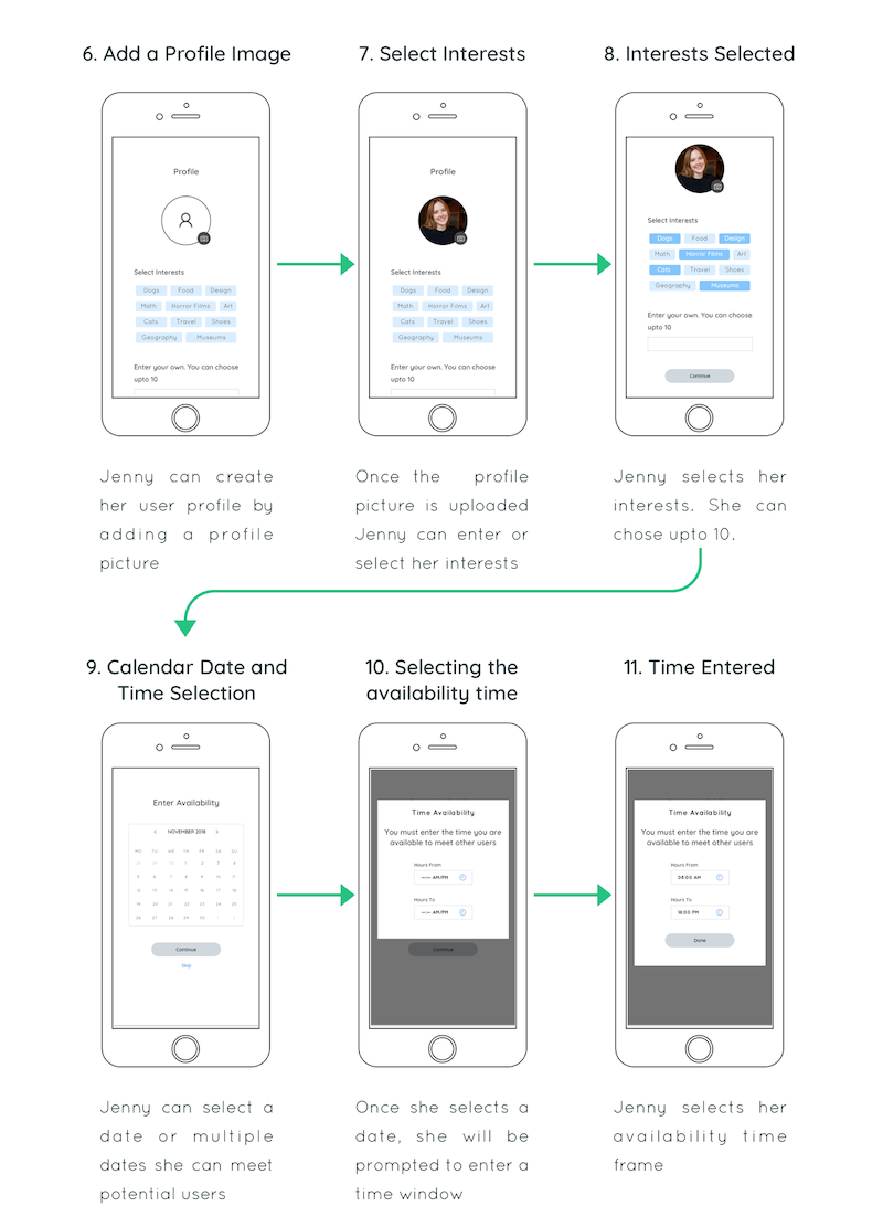
Step 2 - Profile Creation
The next screen consists of a profile screen with an option to upload the users picture, and then select upto 10 interests from recommended interests. The user has the option to enter these manually.
Step 3 - Availability
Once the user creates their profile, the next screen allows them to enter their prefered meetup dates and timings for future dates. This screen has a calendar option for the date selection and a time entry modal. The user has the option of selecting multiple days or they can skip this part entirely.
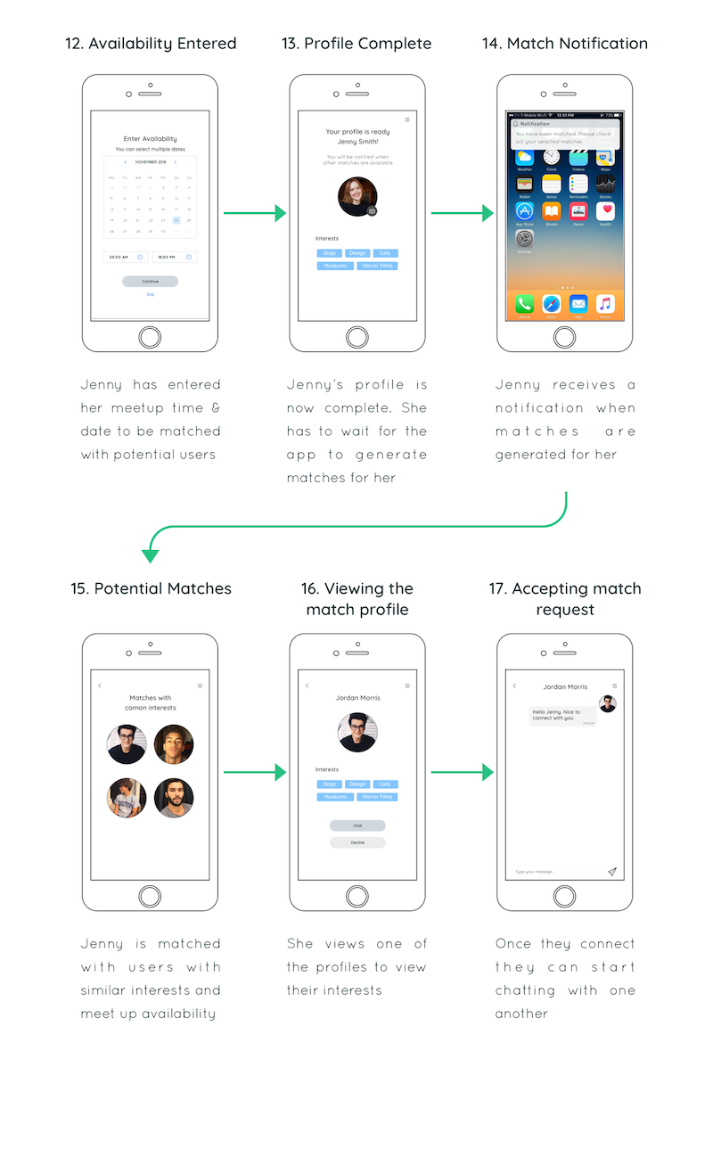
Step 4 - Match Generation
After this step the user’s profile is complete and they must wait for the app to generate matches for them. The next step displays a notification, which when clicked opens the screen with profiles of other users, the user has matched with.
Step 5 - Conversation
Selecting a profile opens the other users profile. This screen consists of their picture, common interests and two buttons, one for chat and the other to decline. As chat is selected, our user can start a conversation with the suggested match.
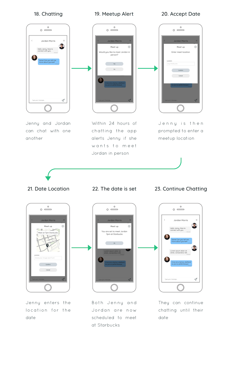
Step 6 - Location Selection
Within a 24 hour window of talking to the suggested match, the user is prompted to meet the person they are chatting with via a modal window. This modal consists of a yes and a no button. Clicking the yes button is followed by another screen asking to enter a meetup location. If the user declines, the reminder will reappear twice after the initial one. Once that is entered, the meetup location and time is set for both parties.
Step 7 - The date notification
Before the date, the user is sent a notification by the app reminding them of their upcoming date.
EVALUATION
In this evaluation, we tested our clickable medium fidelity prototype with four users. They are all online dating app users. We run through our prototype with them and interviewed them with couple questions after they finished the journey in our prototype. We focused on two tasks: creating a online dating profile and planning a date after receiving a match notification. We also observed their actions, emotions, questions, and comments. And we got the following results:
All four user are satisfied with the following features (75% or higher satisfaction rate):
- Creating a profile. It is not difficult to create a profile in the app even though some users thought inputs are too many.
- Most of users are satisfied with their final profile. They thought a lean profile is better than a profile with too many words and pictures.
- Being matched based on interests creates a good connection with strangers and is a good topic to start a conversation with others.
Some features that we need to work on:
- The satisfaction rate of 4 matches are 61%, which is below average. Some users thought it does not matter to get how many matches or they needed more than four matches.
- Only half of users are comfortable with prompt to meet in person. Some of users thought the notification of meet-up pushed them too hard. They do not want to rush when they look for a long term relationship.
Thing surprised us:
- There is a user who only has 54% satisfaction rate, which is lower than other three. We analyzed that the reason could be this user did not align with our app goals. In other words, this user is probably not looking for a long term connection or a faster process of matching and meeting via online dating app.
NEXT STEPS
Our next steps are to further develop parametres for users to meet in person and better facilitate effective matching, striking a balance between allowing users to build trust with one another and encouraging them to take their connection offline. We will cycle through previous steps, particularly the prototyping and usability testing, in order to test different features. Our main focuses are as follows:
- Establish how long users should chat before being prompted to meet
- What the maximum number of prompts should be
Currently, users receive a prompt within 24 hours of matching and if they reject the suggestions, they are prompted two more times within the same time frame before their match disappears. This will balance building trust with meeting in person quickly by giving Jenny enough time to get to know someone and trust that they do want to meet them in person.
We will work to explore the effectiveness of ranking interests and adding disinterests as well. While increasing the amount of interests the user can select, they will be able to
- Choose a top 5-10 that will allow for more compatible matching
- Include “disinterests” is another means to facilitate more compatible matching
With each change, we will conduct another round of user testing to verify if the change improves the app and effectively meets user motivations. Due to the time limitations of the course, we unfortunately did not have the chance to wait for more surveys to be completed and to conduct more interviews and user testings. In order to better understand and validate our initial research results and our main assumptions about dating app users (such as the fact that they want to meet people in person quickly), we need to talk to more real users. Although we received excellent responses and feedback, a larger sample size would strengthen our user experience research insight. As well, the time limitations did not allow for too many iterations and thus we ended at an early stage in the design thinking process. We found that dating app users are frustrated with unclear intentions and how long it takes to meet people, and we created a solution that addresses these pain point; we developed strong foundational knowledge in both a niche market, as well as the design thinking process.
