
INTERACTIVE SUSTAINABILITY DASHBOARD
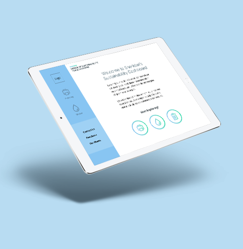
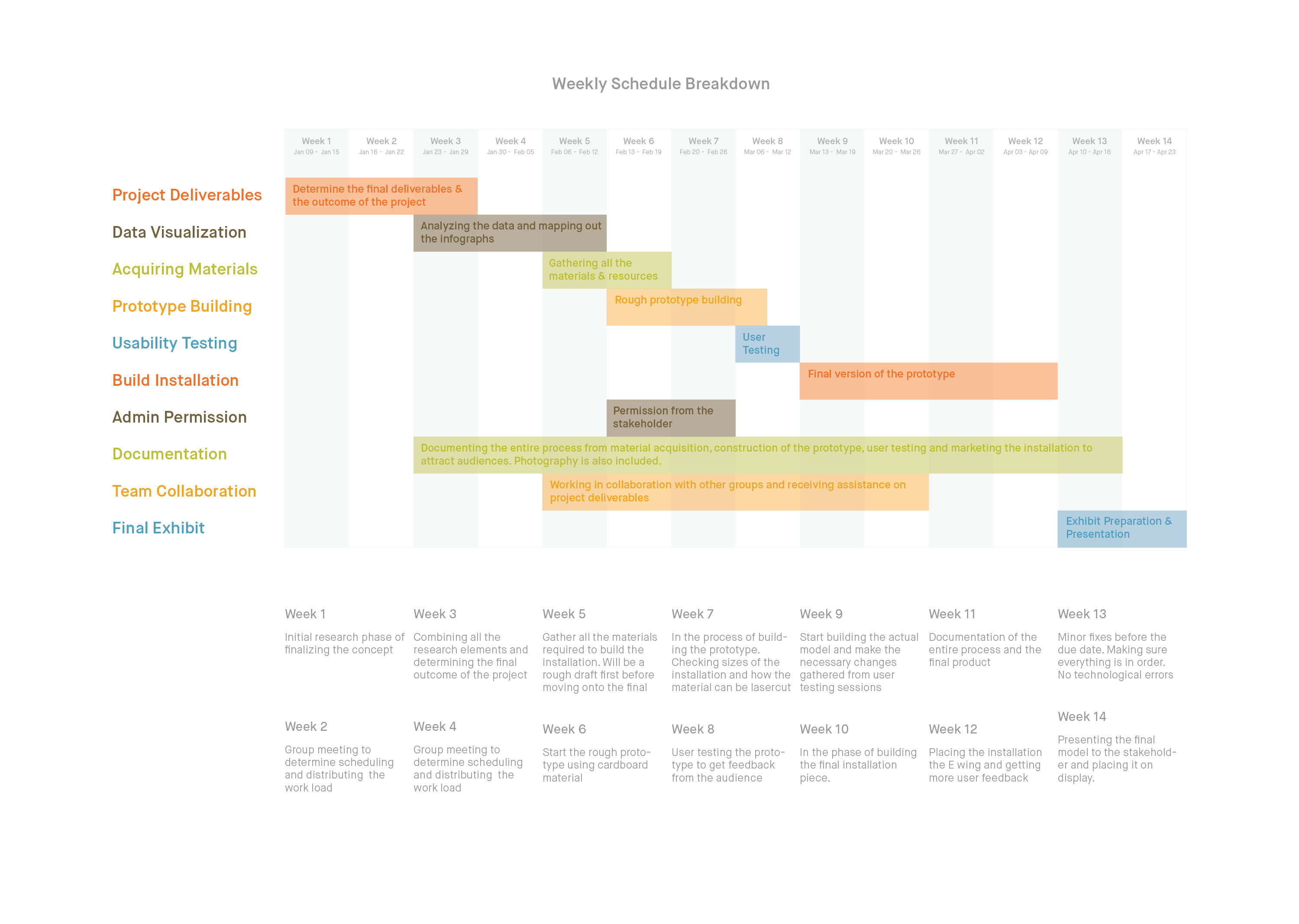
An interactive dashboard drawing passersby into its unique geometric design to explore the initiatives taken on by the Office of Sustainability at Sheridan campuses. Its purpose is raise environmental awareness in an engaging and positive way that encourages participation from all Sheridan programs.
DATES: Sept 2016 - April 2017
ROLE: Team Project
MEMBERS: Taryn Short, Stephanie Charbonneau, Suroor Z Rashid
MISSION STATEMENT
The Office of Sustainability is in urgent need of raising awareness of their zero waste initiative, but also encouraging students to volunteer their time and help in their cause. They are currently working on an interactive dashboard and reached out to the interaction design students to improve upon the dashboard interface and to divert the public to the dashboard.
PRIMARY RESEARCH
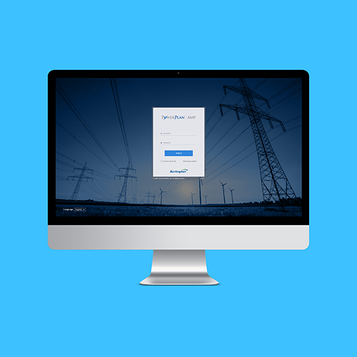
My team members and I wanted to identify what the Office of Sustainability expected from us and to make sure we fully understand the project goals. Before jumping into any conclusions we spoke to the managers of the Office of Sustainability and went over resources available. From there our main research goal was structured. The office wanted to display their dashboard statistics on various screens around the campus. The dashboard is a strong element and showcasing data in relation to recycling, landfill waste, electricity and water is quite exciting. However, how this information should be displayed had to be carefully planned out. We felt that displaying the dashboard by itself on the various screens around campus might not be the best method of getting people involved with the statistics and it might not be a strong tool in creating awareness. We also felt that the the way the data is displayed on the dashboard is not visually appealing. As it is still in the development phase there were a few changes the team wanted to suggest and hopefully these changes can be implemented. We felt there could be a better way to show the dashboard and have students and faculty interact with it.
USABILITY TEST PLAN
The team wanted to initiate the project by conducting user testing of the existing dashboard to identify key pains and gains.
TEST OBJECTIVES AND GOALS
The objective for this study is to collect data, feedback and observations users on their user experience while navigating the teams updated version of the Office of Sustainability’s data dashboard at http://facilities-dev.sheridancollege.ca/
METHODOLOGY
The usability study will be exploratory in nature. It will gather information regarding the users’ experiences as they navigate the Sustainability Dashboard. Each participant will be given given time to explore the site then questioned about their experience with the data.
SCENARIO
Before starting: Moderator Loads Sustainability Dashboard in browser.
“On the screen in front of you is the Sustainability Dashboard. Please navigate your way through the dashboard to educate yourself on the data showcased by the site. As you navigate please verbalize what you feel the message and story the dashboard is trying to convey to you as a user as well as any thoughts, comments, questions, inquiries or concerns you may think of. Please signal me when you feel you have learned all you can from the dashboard. Do you have any questions before we begin?”
TEST TIMELINE
Introduction to session (3 min)
- Welcome them and thank them for coming in to participate in this test.
- Outline how the session will go
- Ask if they have any questions before we begin
Scenario 1 (8 min)
- Introduce Scenario and Tasks
- User performs Tasks
Wrap-up (5 min)
- Additional debriefing
- Additional tester input
- Thank user for time and participation
POST TEST QUESTIONNAIRE
- What are your initial thoughts of the Sustainability Dashboard?
- Do you feel the dashboard successfully represents the data? Please explain your answer.
- What message do you feel the dashboard is trying to give users?
- Do you find the information engaging? Why?
- Based on the information provided do you have an understanding of what impact you have within the sustainable initiatives here at sheridan?
- Would you prefer a more personal approach to your contribution? Why?
- Do you feel that the dashboard motivates you to take action in the sustainable initiatives of Sheridan?
- With the information provided to you on the dashboard do you feel you have a better understanding of Sheridan’s sustainability initiatives and goals?
USABILITY TEST RESULTS
Through the usability tests, we were able to test the usability and interactive experience of the dashboard. We tested the dashboard with 2 users and now have the chance to draw out relationships with the data and pinpoint certain areas of interest and areas which may have stood out during the testing phase. These results are solely on the aesthetics and interaction with the interface as the purpose and initiatives of the dashboard differ between the Office of Sustainability and our group members.
RELEVANCY OF DATA
Data and statistics presented on the dashboard were seen to be singular and did not connect the users to a specific message. Numbers do not reflect whether they are a positive change or are negative and more needs to be done to reverse. The numbers show no relevance to positive or negative influences and does not tie into a narrative or larger picture. The disconnect between the user and the data fails to provide users the necessary information and motivation to act on the environment.
LABEL CONFUSION AND MISUNDERSTANDING
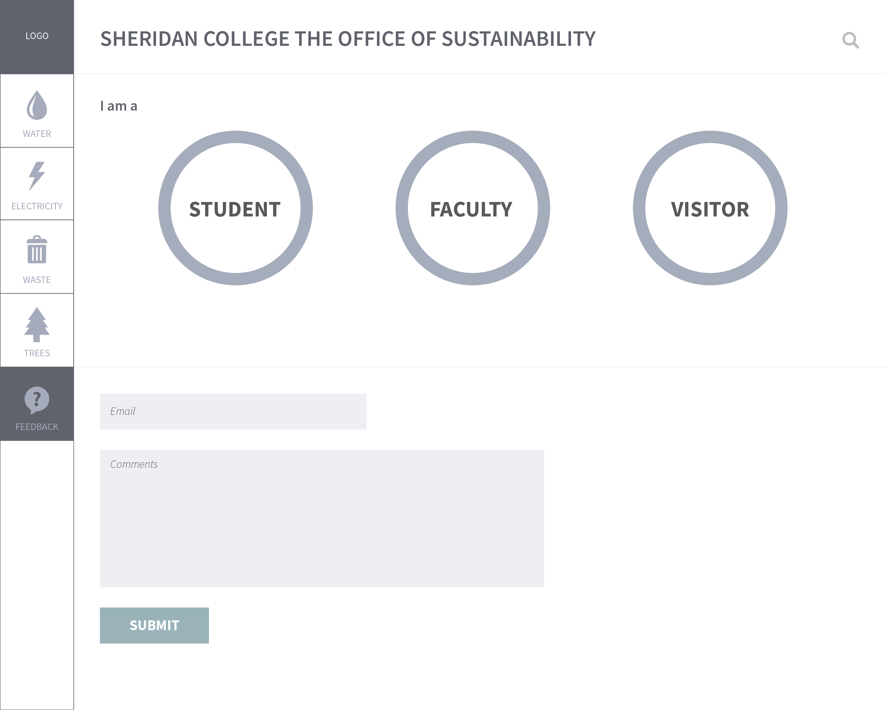
Throughout the tests, both users questioned the purpose of some graphs due to having no units or labels associated with them. At multiple times, one user stated the interface seems too simple and lacks information that may be necessary for an informational dashboard. This was prevalent in the “Water” page with the pie chart above the map. Both users did not understand the information it presented and felt that a short description was needed to explain the message. Users also misunderstood the graphs on the “Trees” section with one user questioning the significance of the charts. Both stated that the circle graphs lacked the necessary units to accurately portray the size comparison. At the “Feedback” page, both users initially thought the button options for student, faculty, and visitor were circle graphs due to them having the same visual appearance as previous graphs. One user suggested to use one color throughout or change the appearance to resemble more of a button.
INTERFACE
In all tests the users found the office of sustainability's interface to be clean, but lacking simplicity and minimalism. They navigated the interface with relative ease and understood the graphs and at the same time claiming the confusion of the numbers and units. The overall aesthetic was also claimed to be not pleasing to the eyes in regards to the color combinations used and spacing of elements. Users did like the themes each section had which helped them differ each page.
CONCLUSION
From a usability perspective, the interface is easy to navigate and does not overload the user by keeping the information on the screen to a minimum. However, this method has flaws in areas that require information to give users context of the graphs provided. While the interface is clean and simple, it lacks in context and data relevancy which users need to be motivated to act upon an issue. Other than awareness, the data does not provide engagement and users are likely to forget about their experience with the dashboard once it is over. With proper context, users will be able to understand the meaning of the data presented and relate it better to sustainability.
PROPOSAL
The dashboard is at a stage where it consists of different elements scattered in various areas. There is a great deal of information displayed and after conducting usability tests and speaking to people regarding the dashboard, the team felt the data can be displayed in a visually appealing format and can have an impact on its audience.
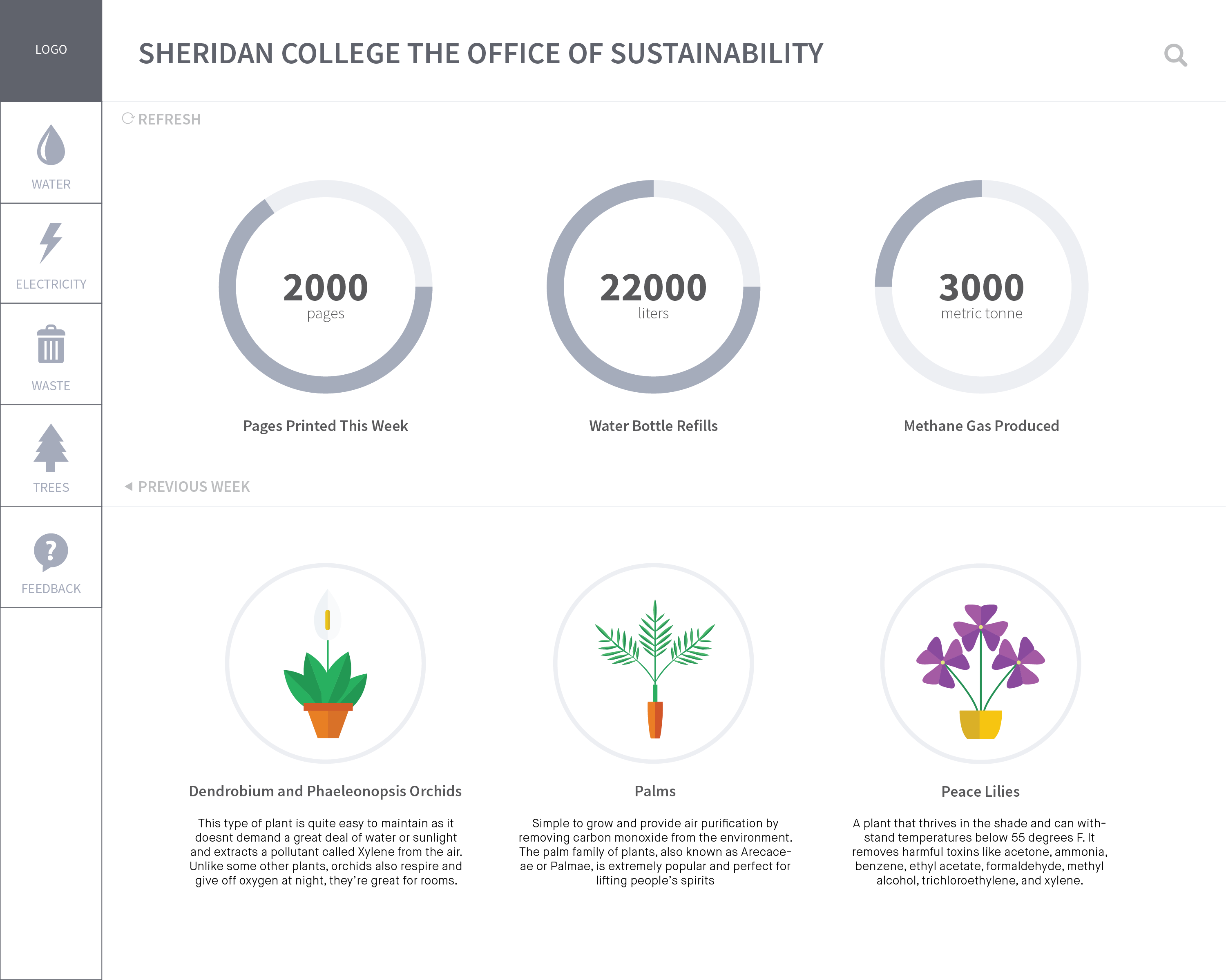
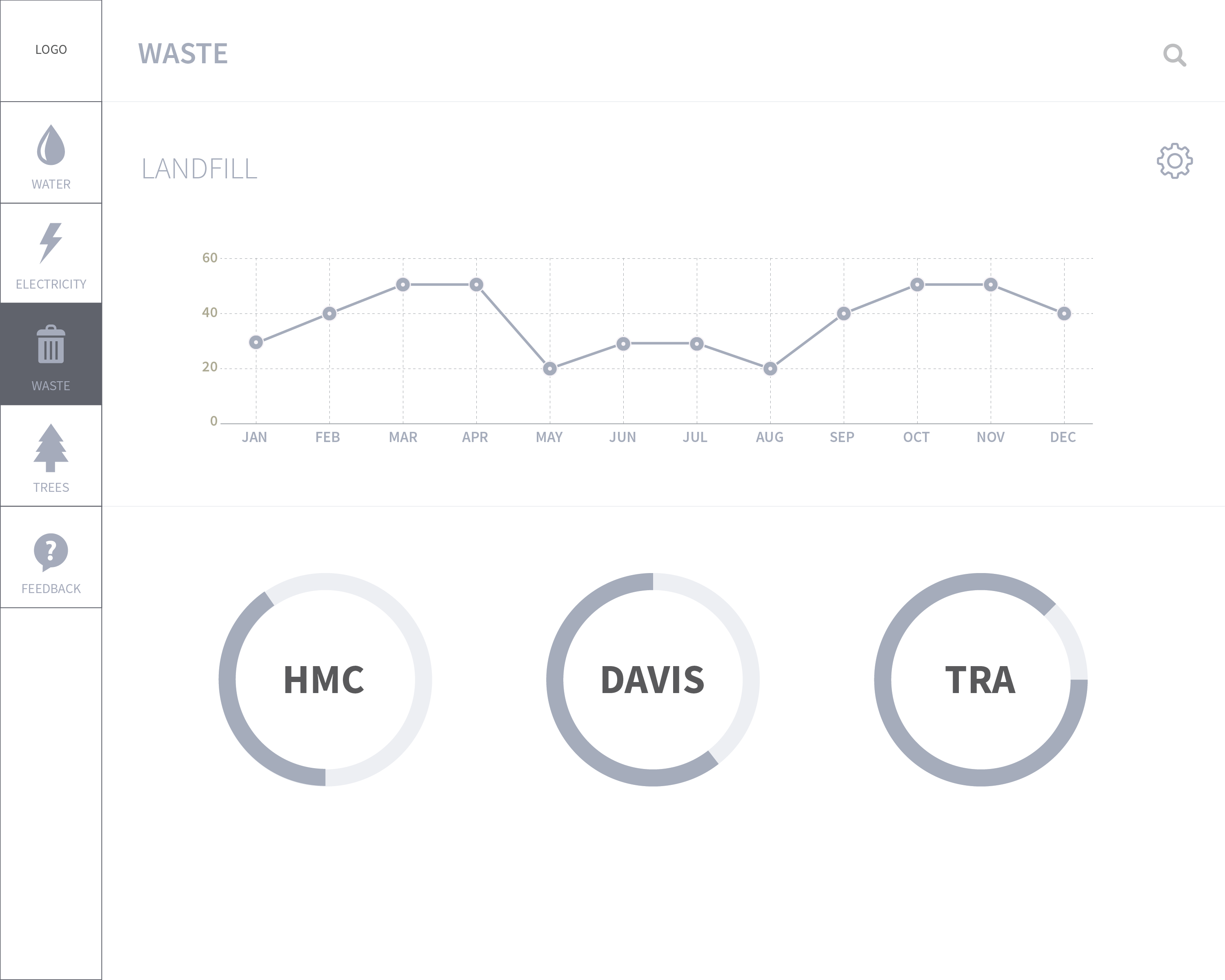
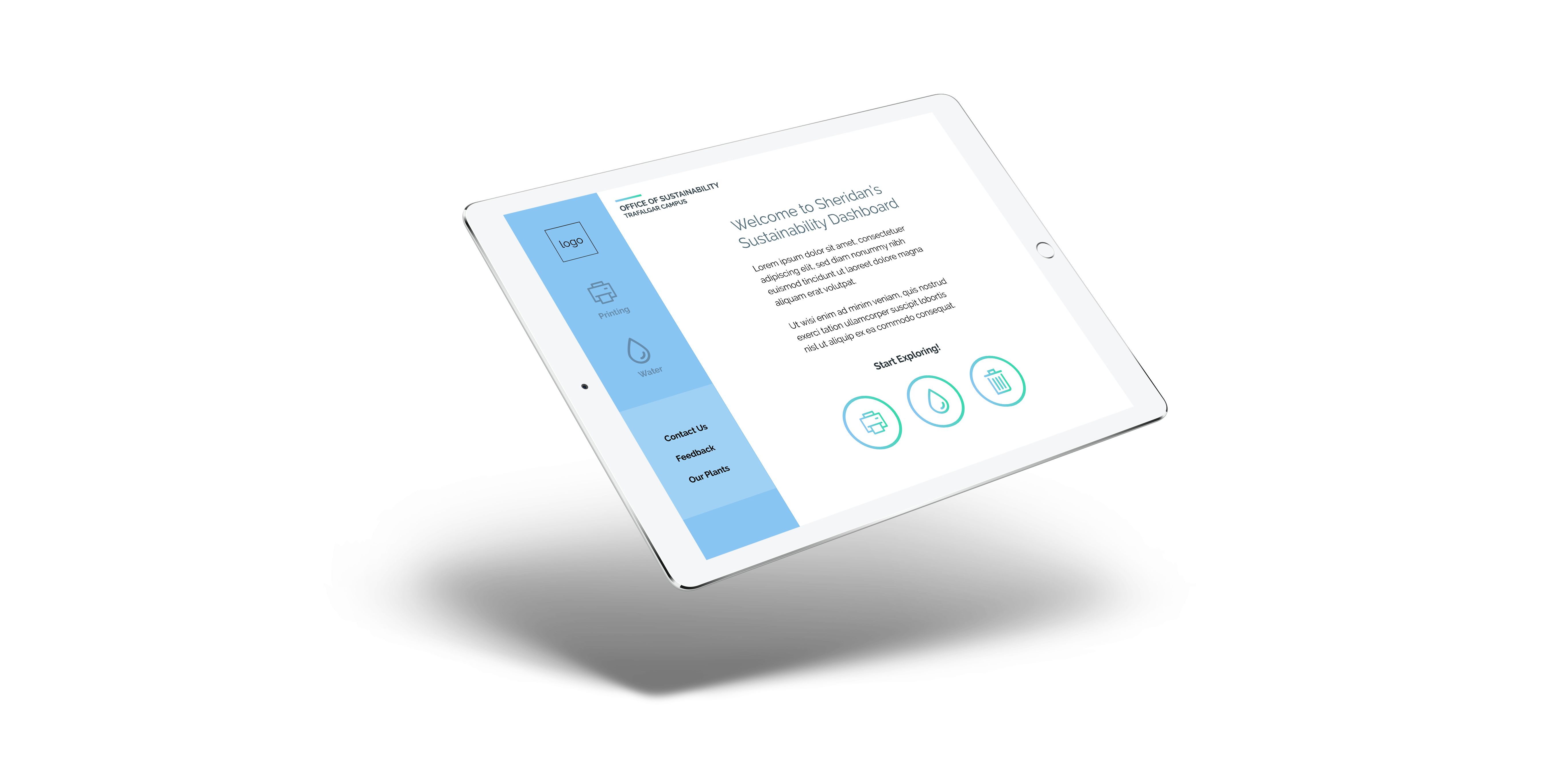
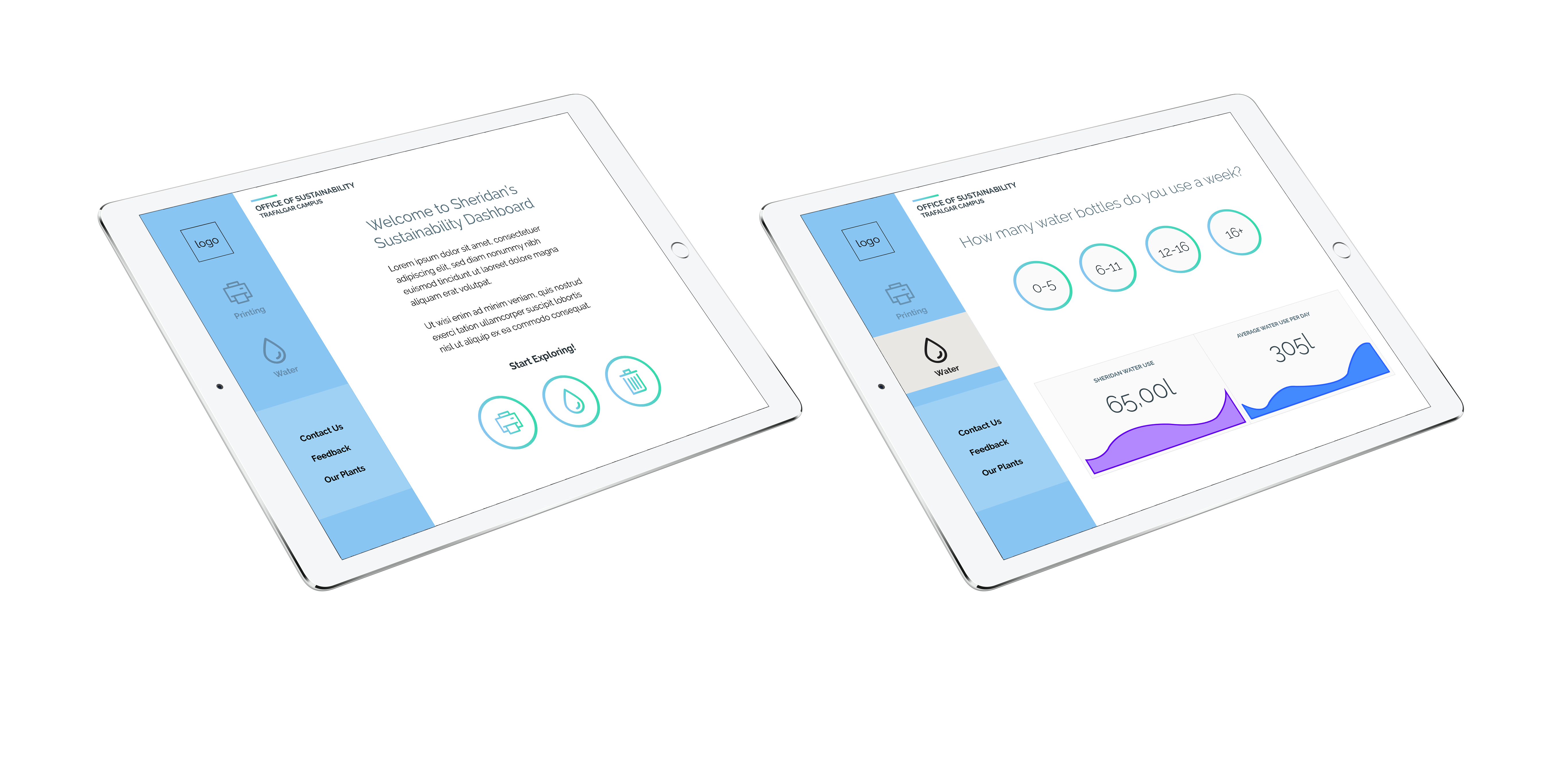
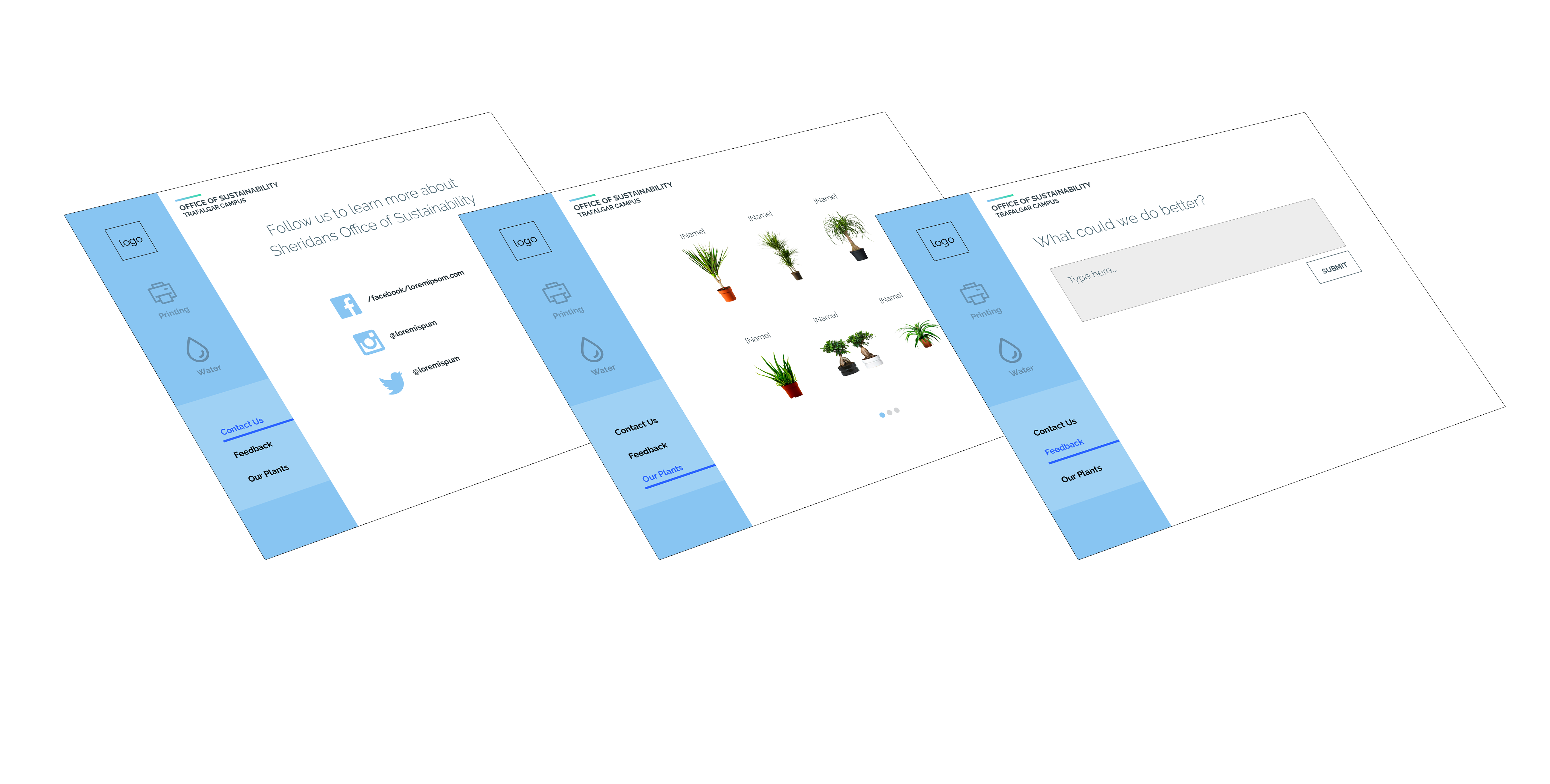
My team mates and I proposed to install an interactive installation at the campus which would include an interactive screen displaying the dashboard. The concept is quite simple. As the dashboard is to be displayed on screens, we wanted to embed a touch functionality. Taking from the design it is at, we wanted the users to select each individual component within the dashboard to get more information. The navigation bar on the left contains all the pages divided into their respective categories. The main page contains data on the number of pages printed per week or per month etc. Users can touch and change the dates for more numbers. It would also contain some information about the installation and the types of plants.
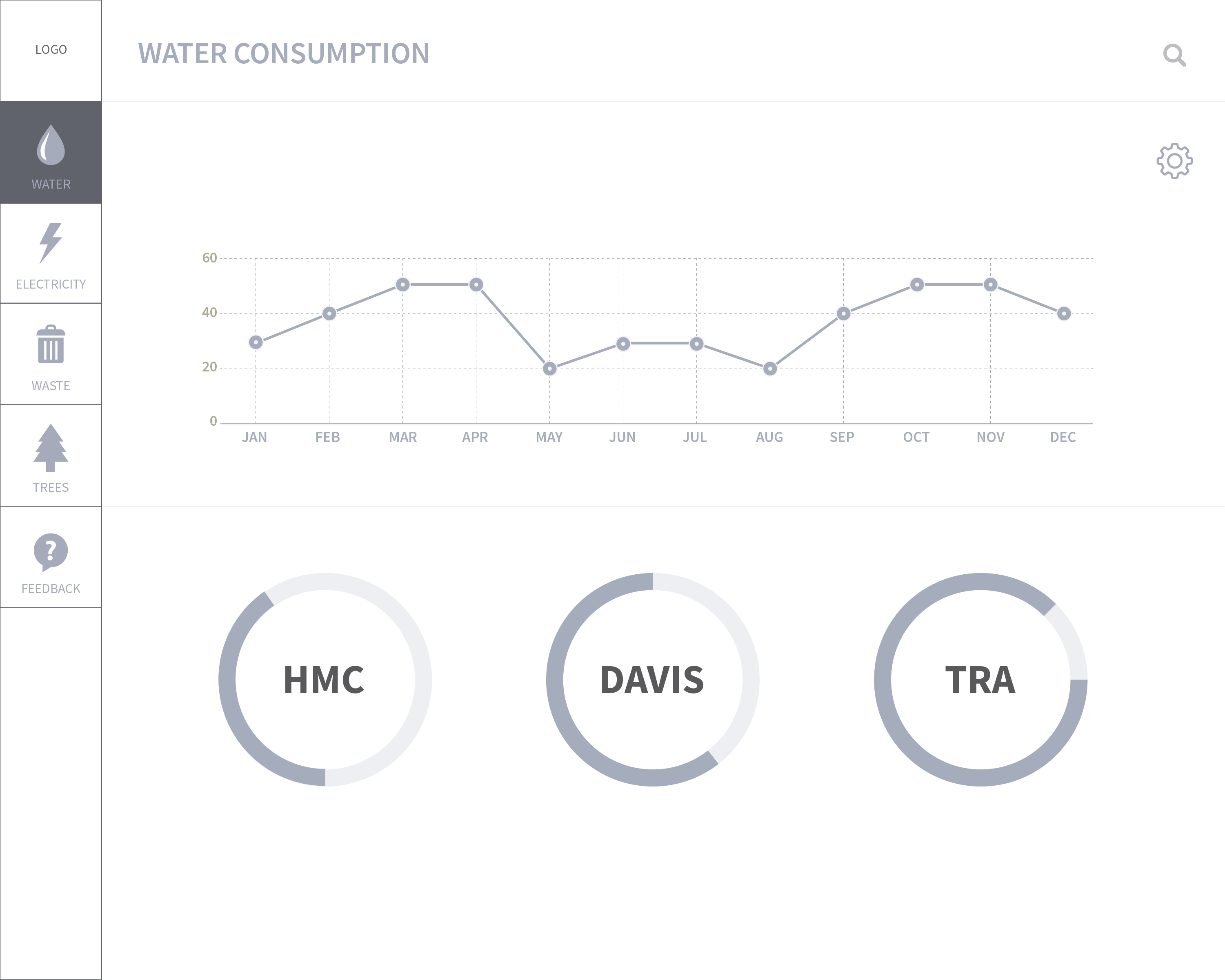
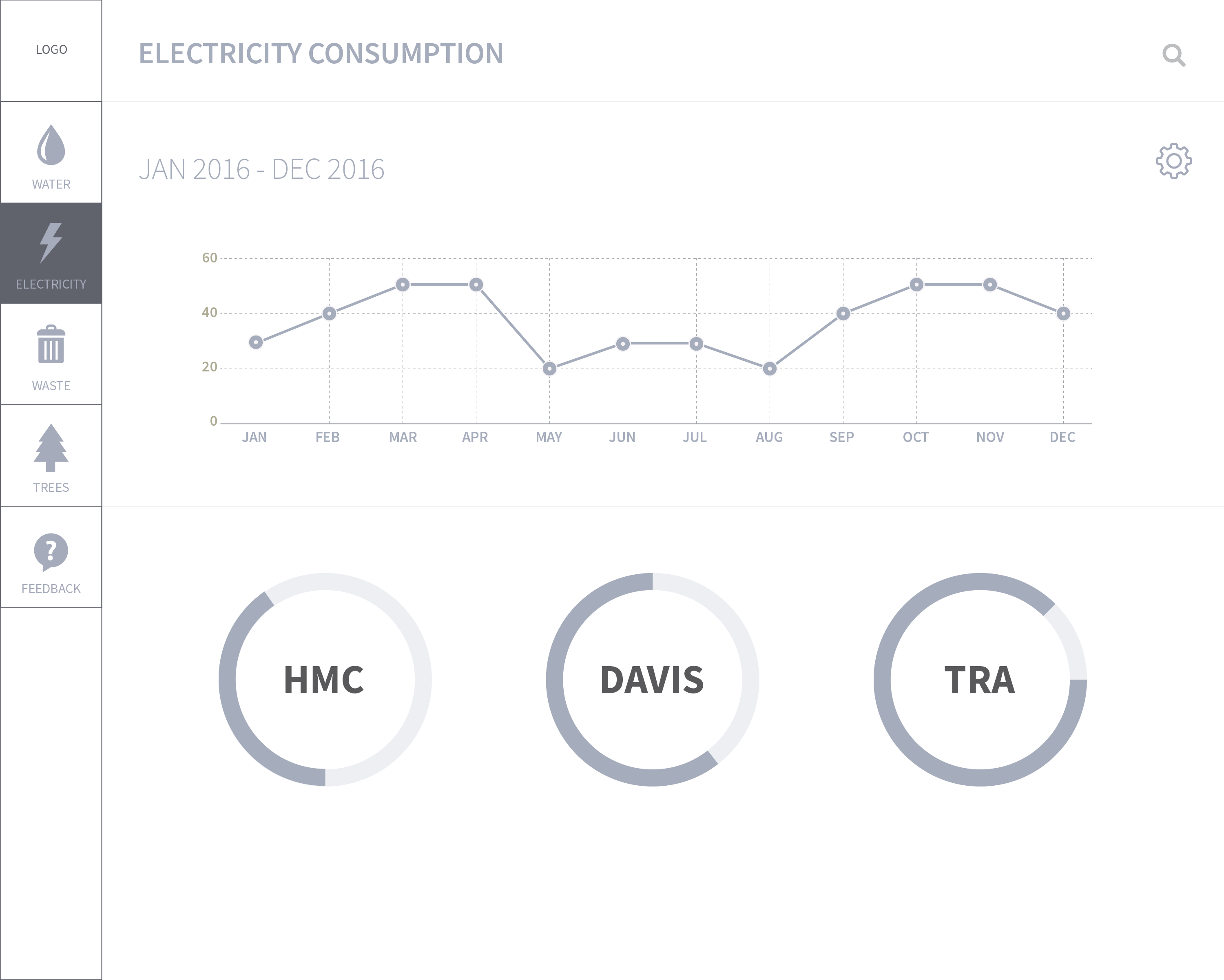
Users can switch between the pages, from water to electricity to trees. Each page has graphs showcasing the same data. The graphs would have an interactive element where users can be expanded the graphs via touch. There is a feedback page where people leave comments and we can get feedback about the installation.
JOURNEY MAP


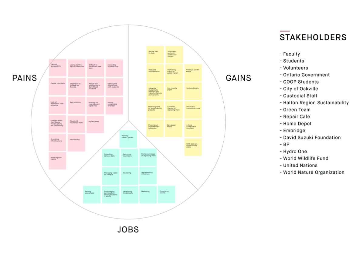
VALUE PROPOSITION CANVAS

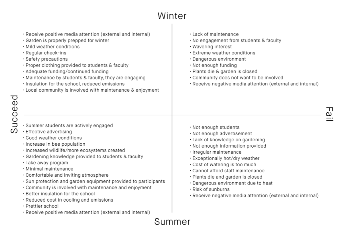
2X2 MATRIX

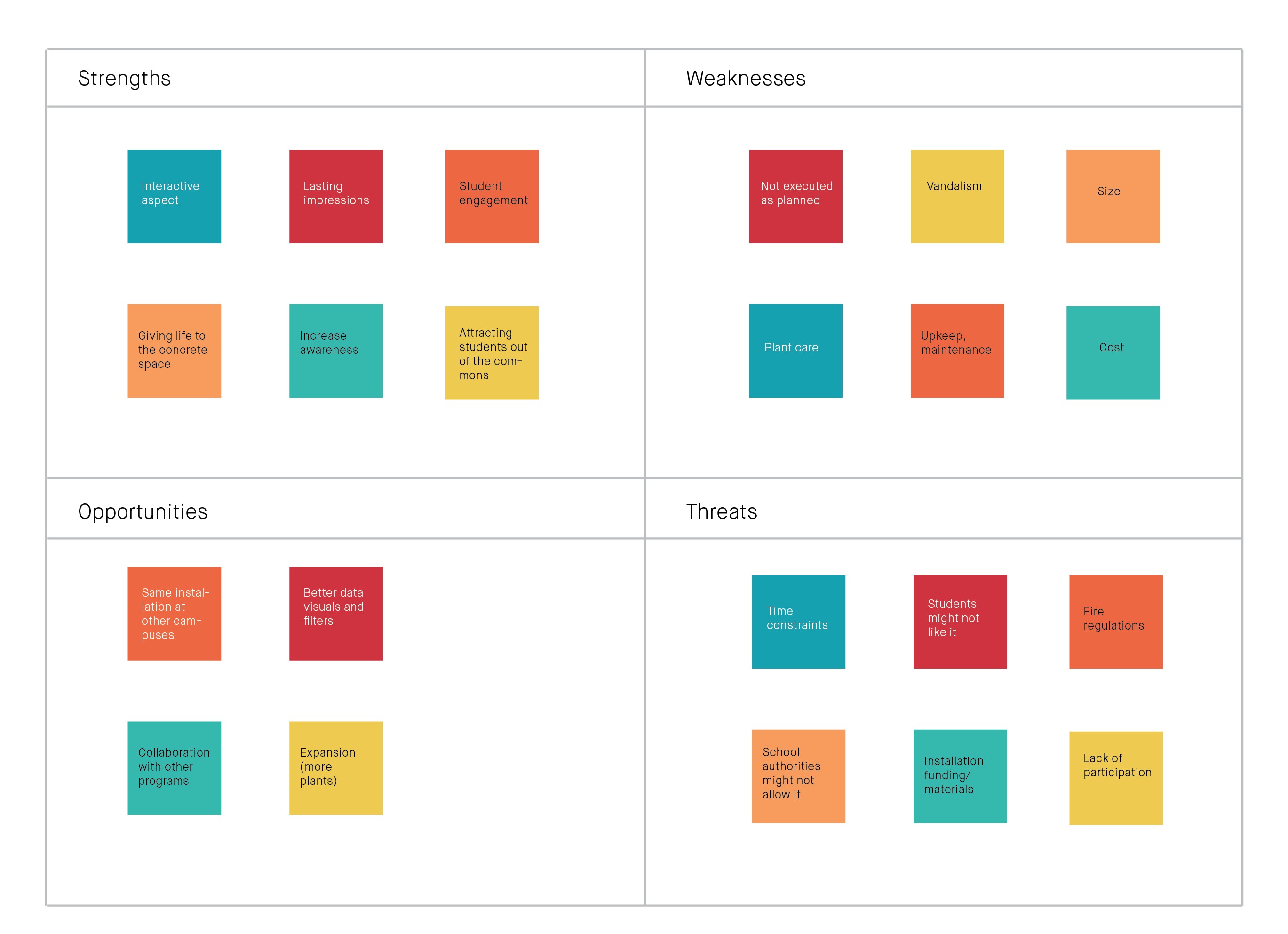
SWOT ANALYSIS

DASHBOARD WIREFRAMES
INSTALLATION
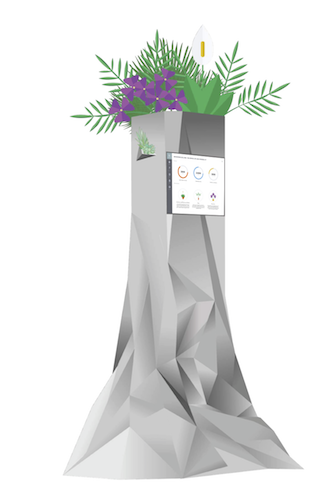
The main focus of the small scale green garden installation is to invite people to interact with a physical object and impact them by creating awareness on the sustainability initiatives taken on by the school. The installation would comprise of a geometric base with a grey and white gradient pattern. The structure is hollow inside and the top area will hold the plants. The interactive screen will be placed on one side facing people passing by.
INSTALLATION MOCKUP

KEY AREAS
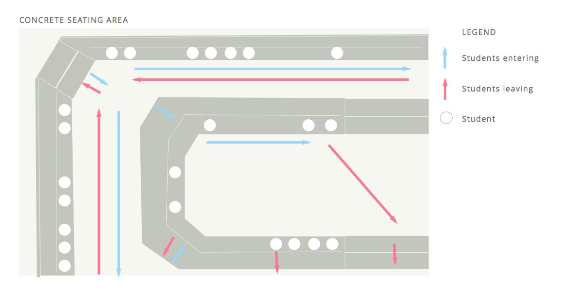
My group members and I conducted observations at different locations around the campus to deduct which area has the most flow of traffic and would be suitable for the placement of the interactive installation. We identified a concrete space adjacent to the library between the G and E wings which had the most people passing by. Having this piece installed in the concrete seating area would give a refreshing feel to the area and have an effect on people’s moods as well.


DASHBOARD UI


PROJECT TAKEAWAYS
Through the course of this semester, we found it extremely interesting the impact that other people have on a pre-existing idea. The way that our concept had evolved in so many ways has been eye opening. We approached this project with our concept going a certain way, and seeing the many different perspec- tives that people have on our concept, and how those different perspectives can improve and validate our initial values.In giving our concept to all the different teams in our class, our product took shape in a way that none of us in the initial group had anticipated. We are rarely in a project manager/client role, and with this project we were able to understand design and development from an outside perspective. We typically take on all aspects of projects on our own with minimal pass offs, but this experience was very hands-off. We had to learn to trust other peoples’ judgement and ideas, as well as critique them along the way.We were able to get far more accomplished than we would have ever been able to alone. With a large team that mainly focused on team members’ strengths, we did not have to stress over aspects of a project in which we struggle, as we knew that someone who actually understands and is efficient at a specialized area. With this, we were able to focus our efforts into managing the various teams, and keep the project on track.
